Hearing more resolutions about traditional weight loss in the new year, the idea of reducing wait time for our students and ourselves seemed easier to address. Similar to snacking in front of a TV, we may not notice how many small ways our time is used non-productively. Yet, each small time-suckers add unnecessary ‘wait’ and cause that hideous online disease, scrollitus. Use the following strategies to unmask the inner beauty of your course content:
- Simplify your contact information. The People block in the top left automatically populates with your name, profile picture and email. If you still have your contact info in the center topic areas, you can instantly save screen space by deleting it now. You’ve probably got your full contact information in your syllabus. If you’d like to add more details, such as office hours, inserting one link from a Google Doc or a Moodle Page you’ve created is more efficient for the students. [Note: If you create a Google Doc, you can share the same link to all of your classes, and only have to update in one place each semester if your hours or location changes! ]
- Use built-in heading features. This might not seem like very much, but using the built-in features in the summary section for each topic saves time and screen space. Renaming the default “Topic #” to the unit/module name helps students find content. Also, putting a descriptive name in the summary uses less space than adding it as a label into the actual topic area. [Bonus: More accessible for screen readers and other ADA assists]
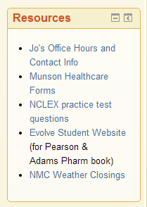
 Put commonly used resources in an HTML Block. Are there items your students would benefit from being able to access quickly and easily, such as a publisher’s homework website, study helps, computer lab times, tutoring help, news feeds, or other external websites? Using an HTML block to make your own list of Quicklinks can save you and your students time. [Hint: This is a great place to put a link to that Google Doc you created with your contact information as well as a printable calendar.]
- Check the sizing of your pictures to be less than 125 x 100 or 100 x 125. Images make the course much more inviting, but large images can take up space better used for content. Resizing images is one way to have the best of both worlds–and keeping images within these size dimensions helps prevent accidental copyright violations. Make sure to use the Image description textbox as well for screen readers. [You can write “null” in this text box if the image is not one that would add value to the learning for someone using a screen reader, saving them even more time.]
If you’d like help with any of your ‘wait’ loss goals for the new semester, please feel free to contact the Ed Tech Department at 231-995-1070, or email me directly at trusso@nmc.edu.
If you are interested in how time scarcity can change our decision-making abilities and negatively impact health, you may want to read Scarcity (Sendhil Mullainathan, 2013) using the scrolling time you save:)

