

Document Title
The Document Title is the overall title/purpose of the document. It is often the same as the file name. The document title is part of the metadata of your document and is the first thing a screen reader will read when your document opens.
How to:
-
- Word: Go to File, Info, and under Properties type in your document title where it says, Add a title.
- Google Docs: Currently you are not able to enter a document title unless you have Grackle Docs as an add-on accessibility tool.
Headings
Headings help you organize your content and provide a structure in your document for screen reader users to navigate.
Just because you make it bigger and bold it, doesn’t mean it is a heading! You can change the look of a heading once you make it a heading. It’s also important to use headings in the correct order and not skip heading levels.
The first heading in your documents should be Heading 1. This is the equivalent of the title of the content or the overarching topic that the rest of your subheadings fall under.
Headings chunk out your content, making it easier to read, much like an outline:
- Heading 1 is like the title of the book and there is just one Heading 1 per page.
- Heading 2s are like chapter titles of the book.
- Heading 3s are sub-sections of those chapters, and so on.
It can be helpful to view the Navigation Pane while applying structure to a Word document, so you can see the headings in an outline style format to make sure you haven’t skipped a heading level.
How to:
-
- Select the text that you want to make into a heading.
- Go to the Home tab.
- In the Styles group, choose the appropriate heading level from the Styles gallery.
Note about Moodle Headings
In Moodle Heading 1 is the title of your course, and Heading 2s are the titles to your blocks. Because these two headings are used by Moodle you will notice in the text editor that the heading choices for you start with Heading 3. This is correct and you should continue to use headings in the proper order.
Text Styles
Font:
Use a font that is easy to read.
- For Word and Google Docs, make sure your font is readable by using at least 10 pt San Serif fonts (Arial, Helvetica, or Verdana). These font types will magnify well for those who have low vision.
- For PowerPoint and Google Slides, consider how far the audience will be from the screen and choose a font size accordingly. Minimum font size should be 24 points.
Text Boxes:
Word, Google Docs, PowerPoint, and Google Slides: don’t use floating text boxes, or text boxes not in a pre-defined template. Adaptive technology may not read them. If read, text boxes are read in the order created, not in the order in which they appear.
Check reading order of PowerPoint slides using the Tab key:
- Click in the gray staging area surrounding your slide or on your slide without selecting any of the placeholders.
- Press Tab. This is the first thing on the slide that would be read by screen reading software.
- Press Tab again to see what the second thing read would be, and so on.
Check reading order of PowerPoint slides using the Selection Pane:
- From the Home tab, in the Editing menu area, click Select and choose Selection Pane…
- Tab through the slide again and the corresponding element will highlight in the Selection Pane.
The reading order starts at the bottom of the Selection Pane and moves up, so if you want to move some element in the slide to the first position reading order, it would have to appear at the bottom of the list in the Selection Pane.
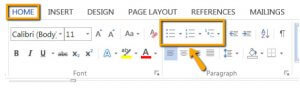
Lists:
Lists are used to arrange or order content so material is more organized. Always use the built in formatted lists styles for bulleted or numbered. Do not use the space bar, increase/decrease indent, or tab key to create lists!
Numbered (ordered) is for items that have a specific sequence, and bulleted (unordered) are for lists of items or concepts that have not set sequence.
How to:
-
- Highlight the text that you want to make into a list.
- From the Home tab, in the Paragraph group, select the Number or Bullets list icon.
Using Links:
Link text should be unique within a page, should be meaningful when read out of context, and should help users to know something about their destination if they click on it.
If you think students will be printing the document and you want them to have the URL, put it in parentheses after the link, but don’t hyperlink it, for example: Northwestern Michigan College (www.nmc.edu).
Avoid using words like:
- click here.
- here.
- more.
- read more.
- info.
- continue.
Usable link text examples:
- Instructions for using Moodle are available online.
- Learn more about color and accessibility in terms of contrast and color coding.
- To see how this works, take a look at this tutorial for Submitting Assignments.
- Step one will take you to the NMC Website (www.nmc.edu).
How to:
-
- Highlight the text that describes the destination link. Example: NMC Website.
- Right click and select Hyperlink… from the menu.
- Type in or paste the URL into the Address box provided.
- Click the OK button when finished.
Tables
- Tables are meant to be used for the presentation of data, not for use as layout or design.
- Tables should always have a title that comes just before it, and the top row should be your column headers.
- Keep tables as simple as possible, avoid splitting and merging cells, and leaving blank cells and rows.
Word:
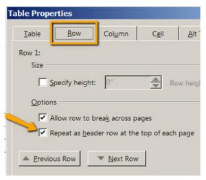
Set your header row (top row of the table) to Repeat header row in the Table Properties and add alternative text. Setting your header row to repeat also makes it nice when you have a table that breaks across more than one page. Your header row will automatically start on the new page.
How to:
-
- Highlight the top row (header row) of your table and right click.
- From the menu that pops up, select Table Properties.
- Select the Row tab.
- Under Options, check the box next to Repeat as header row as the top of each page.
- Select the Alt Text tab.
- Insert a brief description in the Description box.
- Click OK when finished.
Google Docs:
In Google Docs there is no available setting to repeat the header row or add alternative text to your table. If you add the accessibility tool Grackle Docs to your Add-ons, it will provide you the ability to do that.
Color and Flashing Content
Color:
Don’t use color alone (or even a formatting styles such as bold, italicized, all caps) to make a distinction, a comparison, or to set something off or apart from the rest of the document. If you categorize something by color, or even formatting, alone, those who are color blind or blind will not be able to benefit from the information.
A quick example for not using color alone:
- Bad: Correct answers are in green. (True)
- Good: Correct answers are in green. (Correct: True)
Another example is using shapes: “Accessibility Do’s & Don’ts: Red x = Don’t, Green + = Do”
Color deficient users can rely on cues of shape in the “+” and “x” symbols to distinguish “dos” and “don’ts”. Using text symbols with a key is also more accessible to screen reader users than color-coding alone.
Color Contrast:
Use a color scheme that presents a sharp contrast between text and background. Without sufficient color contrast between font and background, people who are color blind and low vision will not benefit from the information. Start here with great information from Penn State’s Accessibility site about Contrast and Luminosity/Brightness and learn what color to avoid.
When using a color contrast checker, you should pass all WCAG AA criteria, don’t worry about passing AAA. Here are a couple contrast checkers to help you:
- WebAim: Color Contract Checker
- Website Checker: WAVE
Flashing/Blinking Content:
Any flashing/blinking content (especially content in red) can cause seizures in people with photosensitive epilepsy as well as other photosensitive seizure disorders, so it should be limited and used only when necessary. Web pages that do contain flashing content, should limit the flashing to no more than three flashes per second and not use fully saturated reds in the content.
Run the built in Microsoft Accessibility Checker
This is a great tool to begin checking the accessibility of your Word documents and PowerPoint presentations.
Please note: In Word, the accessibility checker only checks .docx files.
- Go to the File tab.
- Select Info from the sidebar menu.
- Click on the Check for Issues button.
- Select Check Accessibility from the drop-down menu.
The Accessibility Checker panel will open to the right of the document. The accessibility checker provides you with a list of errors, warnings and tips. When you click on an error or warning, instructions on how to fix it appear below in ” Additional Information”.
Extra Resources
Want to take a deeper dive? Check out these resources:
- Microsoft Word guide to help walk you through how to create accessible word documents.
- WebAim Color-blindness: Visual Disabilities.
- PennState: Color Deficient Vision (Color Blindness).
- Video: How to Use the Accessibility Checker by Portland Community College.
- WebAim: PowerPoint Accessibility.
- Microsoft PowerPoint guide to help walk you through how to create accessible presentations.