

Now that you are more familiar with using Grackle Docs to check your Google Docs for accessibility, here are some tips to keep in mind when deciphering what the results mean.
Red X:
This means you should correct it. These are criteria that must be remedied according to standard accessibility guidelines.
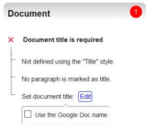
Document title
Most likely the checker will always ask you for a Document Title. Google Docs does not provide you a way to assign one to your documents, but with Grackle you can. Click on “Document title is required” then check the box next to “Use the Google Doc name” and you are all set. The checker will refresh and this item will now be a green check-mark.
 Headings
If you did not use any headings in your document, this section will be marked. The title of your document, or overall subject of the document, is your Heading 1. Simply assign a Heading 1 and any subsections as Heading 2, etc. and this area will refresh to a green check-mark. If you are working with a rather small document, setting your Heading 1 will also address this section properly.
Tables
This will ask you to tag your table or mark it as a layout table. Click on the “+TAG”, this will open up a settings box. If you used a table simply to create a nice document layout and not for data purposes, then check the box “Table is used for layout only” and then click “Update.” However, if you are using the table for data, then you should check “Mark first row as header” and click “Update” when finished.
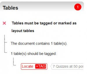 If the check-mark remains red, click the “+TAG” again and it will open an area to insert the alternative text for the table. Fill that in and you should be all set. Both of these options with tables are not available in Google Docs except when using the Grackle Docs checker.
Cautions:
The other icon you will notice is a green check-mark with a red exclamation point. These are cautions.
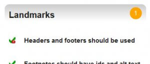
Landmarks
The one you will see the most is “Headers and footers should be used.” This is one caution you don’t need to worry about.
Other cautions you may see are, “All-caps styling should be avoided” or when you change fonts to italicized or bold. The caution is communicating that if you are using these style changes alone to convey important information then you should consider another way. Screen readers or even text-to-speech apps won’t indicate to someone that the font changed.
As you work with Grackle please feel free to reach out with any questions or help in deciphering a red X or caution.