2. Use ALT tags for images
“ALT tags are invisible descriptions of images which are read aloud to blind users on a screen reader. Adding ALT text allows authors to include images, but still provide the content in an alternative format. If no ALT tags are provided, then a screen reader would only be able to say “IMAGE” or perhaps provide a file name.” (PSU.edu)
- All images must have an ALT tag.
- Appropriate tags for images is context based, not sure what to use? Try, appropriate use of alternative tags.
- If images are decorative use “” or NULL, so screen readers will not read the image.
- Avoid providing information within an image only, for example DO NOT USE the following:
How to’s on working with images and links will be coming out soon!
3. Use descriptive URL text
- Change the URL in the Text to display field to something more descriptive. If you can’t read it, it sounds just as helpful.
- Avoid uninformative text such as:
- Click here.
- Here.
- More.
- Read more.
- Link to [some link destination].
- Info.
- Use informative text such as:
4. Tables and data
- Avoid using tables in Word:
- There is no way to assign table headers or <th> elements to a table created in Word.
- In Table Properties menu you can indicate that a row should repeat as header on top of each page. You can also add in Alternative text. If neither of these methods can convey the information consider alternatives.
5. Use true numbered or bulleted lists
6. Check readability of text
- Recommended front size is around 12 points.
- Minimum contrast is greater than 3:1.
- Keep it simple.
7. Don’t use color as the only way to convey content
- This does not mean that you cannot use color in your document or to help visually enhance content, just avoid being dependent solely on color.
For example avoid:
In the following examples: green = passive voice, red = active voice
- She was chased by zombies.
- Zombies chased her.
Instead use:
- Passive example: She was chased by zombies.
- Active example: Zombies chased her.
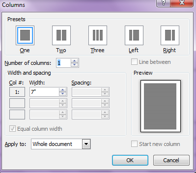
8. Use true columns (not tables or tabs) to divide content

9. Provide a table of contents for long documents
- If you use Headings, creating a Table of contents can be done automatically for you by Word.
10. Check your documents!
- Use the accessibility checker in Word: Select File > Info > Check for Issues > Check Accessibility.
For more on how to work with documents check out:
It’s impressive that you are getting thoughts from this article as well as from our argument made
here.