What changed?
You’ll notice updates to the editing icons and and to the action menu for blocks; as well as improvements to the text editor.
Many of these changes have been implemented by Moodle in an effort to increase accessibility of Moodle by improving navigation, or the interface, for screen readers and keyboard users. Many of these updates have also increased access for mobile device users with responsive design, better navigation and allowing access to editing functions.
Here’s a look at what you will notice once you turn editing on:
On the course page
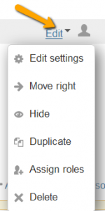
Icons after each item have been condensed under the Edit dropdown menu. The Move icon is now in front of each item, the Edit title comes right after the title, and the group icon is at the very end of the line.
Once you click on the Edit dropdown, you can clearly see each icon along with its function listed.
Responsiveness of the Editing options has also increased. For example, if you use Duplicate you do not need to work with another secondary window before editing the copied item.
For the blocks
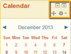
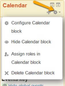
For editing blocks, the Hide and Delete functions are now under the Actions drop down menu.
Inside text editing boxes
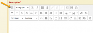
The text editor will automatically display a much cleaner initial row of icons (you do not have to toggle this row on). To see more advanced choices, clicking on the toggle button on the left will open up two more rows of icons.
Note these two icon changes:


