

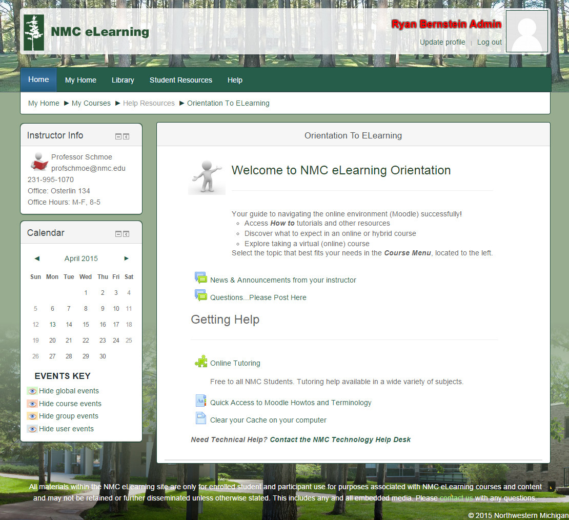
Last month, Mark Delonge told you about upcoming Changes to Moodle, including the shift to a new, responsive Moodle theme. We’re happy to tell you that later this week NMC instructors can start logging into their summer and fall courses to see the new theme. The new theme will not be applied to current courses.
What does ‘Responsive” mean?
The number one reason behind adopting a new theme is to accommodate students and instructors who are accessing Moodle from mobile devices. This theme is responsive, which means that it will respond to the device that is being used to access it. Whether you’re using a desktop computer, laptop, tablet or smartphone, Moodle will now look and work great.
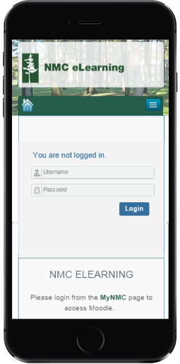
Moodle on a smartphone:
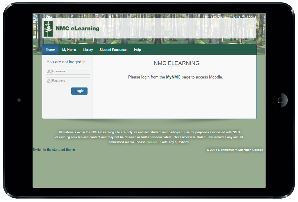
And on a tablet:
What else can we expect?
You’ll also notice that the new theme only allows for blocks to be added to the left hand side of the page, as opposed to blocks in both sidebar columns in the current theme. It may be useful for instructors to add some blocks to the docking bar to use space effectively. There’s also a nifty back-to-top button that you can click on when you’re on the bottom of page instead of scrolling all the way back up yourself.